Full text
Spotify has the upper hand out of all the best music streaming services because of its hyper-personalized feed and social features, but its app design isn’t the greatest.
I’m not the first power user to call out the platform for its stuffy and, at times, unorganized layout. The ‘Your Library’ section, for example, is a cluster of your recent activity, which you can only rearrange using the filters at the top of the screen — full customization is out of the question.
After using Spotify alongside Apple Music , there’s no comparison — the latter packs a simple and concise interface, with a bright and sleek finish, and there’s Spotify could certainly take a page out of Apple Music’s book on the organization front. However, one user has, at least, found a hidden setting that allows you to switch from Spotify’s dark color scheme to a brighter one similar to Apple Music's.
A Reddit post shared by u/Hot_Perspective (see below) shows two images of the Spotify mobile app with inverted colors enabled, which essentially replaces Spotify’s dark appearance with a ‘light mode’ one consisting of an all-white background reminiscent of Apple Music’s interface.
Do you know u can use Spotify in light mode in iOS it looks pretty 😍 from r/truespotify
The thing to note here is that it’s not actually controlled via the Spotify app; it’s all done through iOS or Android settings — and it’s simple to enable.
If you’re using an iPhone, open Settings and head to Accessibility, then tap Per-App Settings. From there, you’ll need to tap Add App and search for Spotify. Once you’ve added Spotify select Smart Invert and enable the toggle. Android users can enable this feature also by heading to Settings and tapping Accessibility, then Text and Display. Find Color Inversion and toggle it on.
What an eyesore
If you haven’t yet come across this tool, it’s a stark difference from Spotify’s traditional dark-theme interface to say the least.
While it flips the dark in-app color scheme on its head, it’s smart enough to know not to invert album and playlist covers, so not every part of the Spotify app is inverted — which I think is quite clever. But despite its accessibility benefits, it hasn’t been a huge hit with music fans, myself included.
For one, it doesn’t solve the issue of the cluttered and unorganized interface, it just adds funky colors to the app. That aside, it’s frighteningly bright, I’d say even brighter than the average smartphone display setting — the meme replies in the Reddit thread have cracked me up (see the countless reaction images).
Comment from r/truespotify
I can’t exactly explain it, but there’s something very 'uncanny valley' about Spotify with inverted colors. It sort of looks like Apple Music, but I know it’s not. I even lost my muscle memory while trying to navigate it — it threw me off that much.
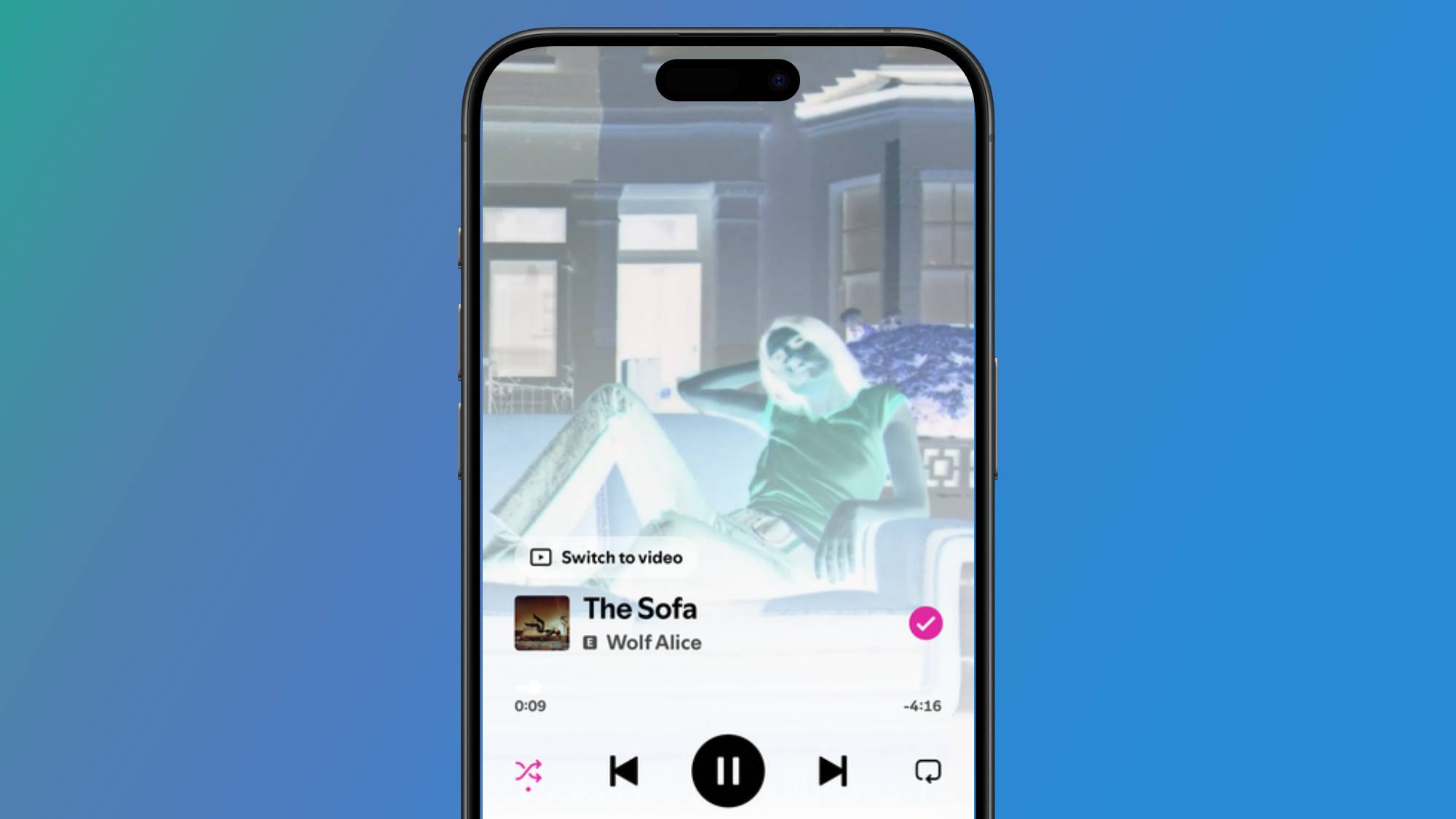
As we all know, Spotify loves a good visual, and most songs on the platform display a short looping video in the playback section of the app, but inverted colors interfere with this, making visuals look like X-rays. But even if you like how it looks, it has a knock-on effect for both iOS and Android smartphones.
(Image credit: Future) Because Android doesn’t allow this tool to be enabled for individual apps, you’ll have to put up with inverted colors across your entire system, which is quite a strain on the eyes. While iOS allows you to enable inverted colors for separate apps, you need to have the system-wide Light Mode setting turned on for it to work. This means that if you’re like me and prefer to use Dark Mode in apps like Instagram and iMessages, you’ll have to sacrifice this — it’s an all-or-nothing situation.
I think it’s appropriate to say that, overall, it doesn’t sit well with a lot of subscribers. It does, however, remind us that while Spotify has yet to fix a few layout issues, at least the platform has a solid brand identity.


Comments
No comments yet — be the first to weigh in 👇
No comments yet. Be the first!